In the 1920s, the historian of art and culture Aby Warburg (1866-1929) created his Bilderatlas Mnemosyne tracing recurring visual themes and patterns across time, from antiquity to the Renaissance and beyond to contemporary culture. His approach provides inspiration for today’s visually and digitally dominated world. At HKW all 63 panels of the Atlas will be recovered for the first time from Warburg’s original images.
Aby Warburg with Gertrud Bing and Franz Alber in front of Warburg’s panel design, Rome, Palace Hotel, May 1929
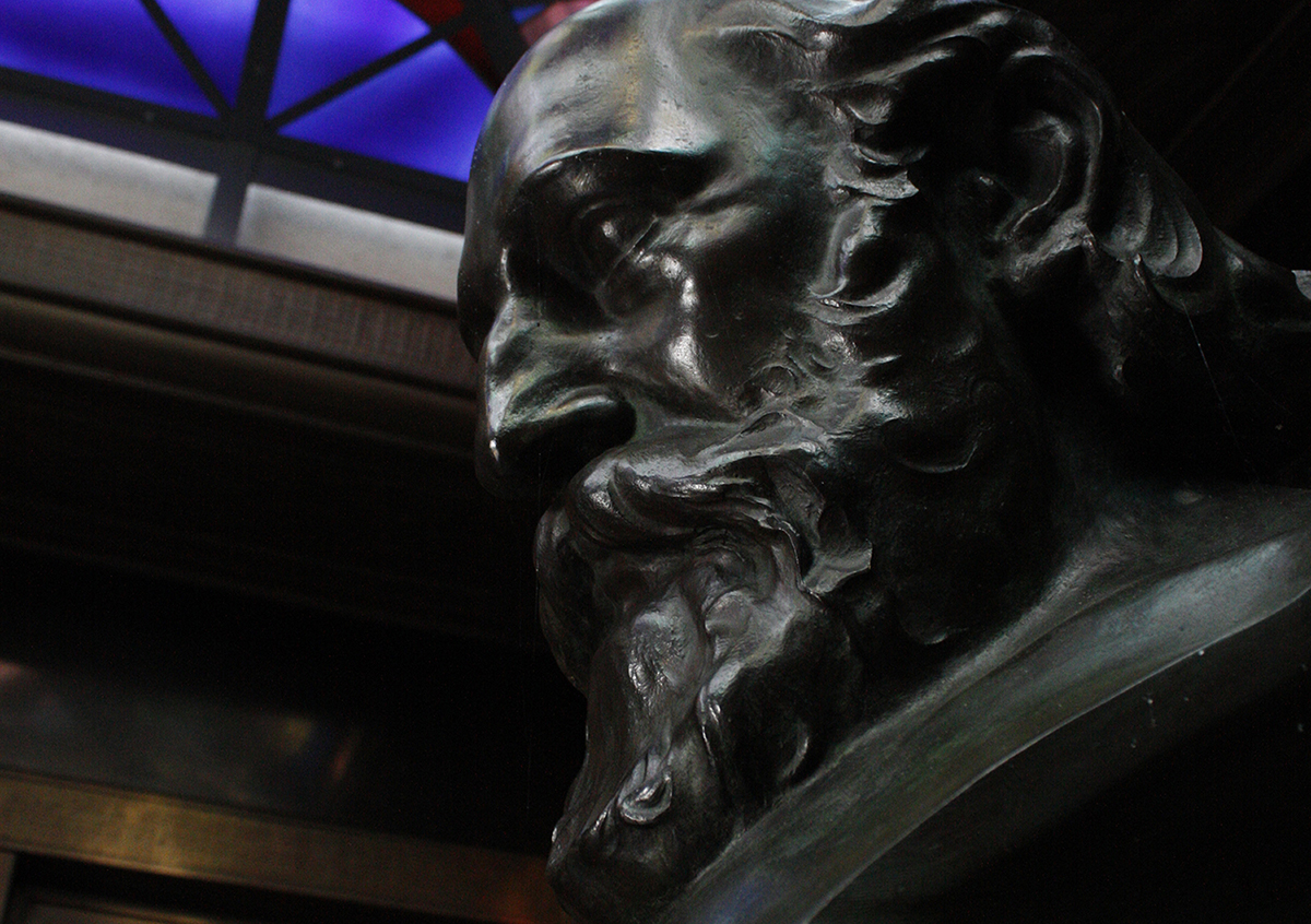
Aby Warburg studied the interplay of images from different periods and cultural contexts. He designed the Mnemosyne Atlas to provide a pictorial representation of the influences of the ancient world in the Renaissance and beyond. In its last documented version, the Atlas consisted of large black panels on which Warburg placed photographic reproductions of artworks from the Middle East, European antiquity and the Renaissance, alongside contemporary newspaper clippings and advertisements. In the years leading to his death in 1929, Warburg and his closest colleagues Gertrud Bing and Fritz Saxl experimented with the form and function of the Bilderatlas. Their goal was to present a publication designed for discussion among experts as well as the broader public. During the course of its creation, the Atlas developed into an instrument of cognition.
Aby Warburg, Bilderatlas Mnemosyne, panel 39 (recovered, detail) | Photo: Wootton / fluid; Courtesy The Warburg Institute
Warburg’s method set new standards: it consisted in rearranging canonized images and looking at them across epochs. His project traversed the boundaries between art history, philosophy and anthropology and was fundamental for the modern disciplines of visual and media studies. Today, his use of visual memory provides inspiration and alternative routes through a reality dominated by visual media.
The exhibition at HKW restores the last documented version of the 1929 Atlas almost completely with the original images. In collaboration with the Warburg Institute in London, the curators Roberto Ohrt and Axel Heil have located most of the originals, some partly in color, 971 images from the 400,000 individual objects in the Institute’s Photographic Collection to show all 63 panels of Warburg’s unfinished magnum opus for the first time since his death. In addition, 20 unpublished large-scale photographs of panels that were previously only accessible in the Warburg Institute archives will be shown: Most of them made in autumn of 1928, they originated from the previous versions of the Atlas and are presented as large prints of the original black and white negatives.
In 1997 two spaceships were launched from Cape Kennedy containing material to represent life on earth. The ambition of the project was to make hypothetical contact with extra-terrestrial intelligence. The choice of material was subjective to an American, scientifically educated, 1970s community, with paternalistic attitude towards the rest of the world. But who consulted us? We were not asked to make a contribution and we must do something about this falsification, especially now as we approach the end of the second millennium, when everyone is making lists and taking stock of what has been achieved.
With a mixture of irony and seriousness, the filmmaker, artist and director has chosen to put together his own shopping list called 100 objects to represent the world. After presenting this 100 objects in an exhibition at Vienna’s Hofburg Palace in 1992, Greenaway now brings the objects to an audience instead of bringing the audience to the objects: in a completely new and theatrical setting, light, sound, voice and music will be part of a modern opera – a prop opera. The importance of the prop should not be underestimated in our own materialistic and icon-producing world. Can you imagine a Chicago Gangster Film without a gun? But the objects to represent the world are not inanimate but are presented in a mixture of Machiavellian, galactic toy store and Faustian dream space.
The opera set is an installation that can be contemplated on stage also before and after the performance.
The 100 objects are presented in a sequential narrative by Thrope the Misanthrope, who guides us and Adam and Eve (two silent, naked actors) to show what mankind has really learned during the past millennium: from the comforts of domesticity and sentiment, through the delights and torments of sex, power and money, to the tragedies of war, disease, loss and death. This journey is to be traveled in 70 minutes, structured by Thrope’s spoken discourse. His dramatic performance is accompanied by the soundtrack of Jean-Baptiste Barrière (engineered at IRCAM Paris), making him a teacher, a pedant and persuader, a charlatan and preacher.
The Tourist Office of the canton of Neuchâtel has been developing several concepts for visits around the topic of watchmaking and time measurement for several years now. It will be necessary to work with them to promote the exhibition project at the Neuchâtel Observatory and include it in their programme.
The Franco-Swiss region between Besançon (historic watchmaking city with its mythical observatory) and La Chaux-de-Fonds has developed a concept of “Time measurement route”. It would be interesting to inscribe Neuchâtel with its observatory to link the two historical observatories because historically they worked together! PDF file of the flyer.
When “Mark Twain” was cut down in 1891, the giant Sequoia was 1,341 years old and measured 331 ft (100.9 m) high and 90 ft (27.4 m) in circumference at the base. Today a stump is all that remains of the once thriving tree that might have survived another thousand years. A cross section is on display at the American Museum of Natural History in New York; the curator at the time marked on its annual rings selected events of human history.
Photo Credit: Compton’s Pictured Encyclopedia and Fact Index (1947)
Museum exhibits can be pricey. Whether it’s a permanent installation or a travelling exhibition, myriad influences can affect the cost. Image acquisition, AV hardware, shipping, materials, and more, can quickly throw a conservative project budget way off track, unless these aspects are carefully considered during the design process.
Current estimates for the cost of museum exhibits are around $75 to more than $800 per square foot. This ridiculously wide range is due to a number of factors that differ from project to project, but which clearly make exhibit budget planning difficult, uncertain, and frightening. Whether your institution is flush with cash or on a shoestring budget, here are five proven methods for keeping your exhibition project costs in check:
Have a Contingency
A contingency is money set aside, to be used for increases in market costs or unforeseen items and services. For an exhibit project, it’s wise to have both a design contingency and a fabrication contingency. The design contingency can help fund great ideas that are born during the creative process, which might be financially more ambitious than the original program. A fabrication contingency will cover unpredictable costs related to things like travel, shipping and materials.
Reduce the Scope of Work
As the saying goes, “You can have anything, but you can’t have everything.” One of the fastest ways to get your exhibit costs in-line with your budget is to trim some of the fat. This could include implementing strategies such as reducing the project’s square footage or decreasing the number of trips or meetings.
Involve Fabricators Early
Whether you’ve hired a design-build firm or a sole exhibit design specialist, it helps to bring in a fabricator during the creative process. An exhibit fabricator can assess the physical design – from as early as the concept phase – to provide accurate cost estimates, material and finish suggestions, and coordinate ongoing museum architecture or general contracting work.
Communicate Honestly
This is a two-way street. Exhibit designers owe it to their museum clients to be frank if the project expectations and brainstorming ideas outweigh the project budget. Likewise, if during the creative process a designer is recommending solutions or technologies beyond your comfortable reach. If this happens then you need to speakup, put on the brakes, and reevaluate what your budget can afford.
Avoid the Bandwagon
It’s easy to get caught up in high-tech trends, and to assume that your visitors expect theatrical immersion, multi user interactive tables, mobile apps, and AR or VR experiences. Although these things can enhance a museum exhibition and provide unique content delivery, they may not be realistic within a conservative project budget. Consider these costs at the beginning of the project and involve a media developer in the conversation so that s/he can share ideas and provide alternatives that fit within your budget.
It’s likely that following just one of these five strategies will help to keep your exhibit project on budget, but you may need to meld a few of them. Working with your partners, the project budget should be discussed and re-assessed from day one – from the kickoff meeting through to the project’s grand opening. Everyone must be aware of the budget, so that the entire team can be responsible for keeping it in check.
Géraldine Heller and Fabio Spink took part in a competition for the redesign of the concentration camp memorial site in Neudorf near Vienna. In their contribution for Hochparterre-Campus, the two students from the Institute of Industrial Design HGK FHNW explain how they proceeded and what motivated them to design an ACOUSTIC PARK.
Author: Isabel Singer –Exhibit Developer at Luci Creative and the Chairperson of the Chicago Museum Exhibitors Group Steering Committee.
Posts on a series of articles on virtual exhibitions
Museums have always been primarily
physical spaces. However, as the wave of COVID closures continues to
sweep across the world, museums need to find more ways to connect with
visitors at home. In response, an increasingly large number of museums
have been creating virtual exhibits.
Unfortunately,
most virtual exhibits are not serving visitors, as evidenced by the
fact that online exhibits are the least popular part of museum websites
(Doukianou et al, 2020, 3). It is incredibly challenging to make a good
virtual exhibit because the scholarship on them is in its infancy and
there are no tried-and-true best practices to rely on. As Thomas
Campbell, director and CEO of the Fine Arts Museums of San Francisco,
stated, “This will be a time of reckoning and reflection for museums
trying to substantiate their footing in the digital world. For all the
feverish diversity of content now on offer, the digital platform is
often facile, superficial, and undiscriminating” (Kozari, 2020).
Since virtual exhibits aren’t serving visitors, should museums even be making them? Museums should create experiences that align with their goals. So, let’s take a step back and consider the goals that online exhibits can fulfill.
What makes a virtual exhibit different
from a website? Or, from an online collections database? Does a Zoom
tour of a physical exhibit count? What about a 3D digital twin? Do these
distinctions even matter?
As I dived into my research on virtual
exhibits, I quickly realized most scholars create their own definition
of “virtual,” “digital,” or “cyber” exhibits to suit their research
goals. Some scholars define them as any representations of collections
objects in digital spaces (Bonis et. al.,2013, 183; Perry, 2017,1),
while other scholars also include mixed reality and augmented reality
applications that engage physical objects in physical spaces through
digital means (Döpker, 2013, 2308) A few scholars defined virtual
exhibits based on their purposes: marketing, relaying collections
information, or contextualizing collections (Doukianou et. al., 2020,
3).
While I don’t think there’s much use in wordsmithing definitions, I do think it’s important for museum practitioners to have a general consensus about what we mean when we say “virtual exhibit.” If we can’t agree on what we’re talking about, or, more importantly, what it needs to accomplish, it’s going to be pretty hard for us to agree on how we should do it.
The best museum labels do more than provide information. A great
museum label takes its reader on a revelatory journey, reframing
perceptions along the way and provoking a lasting reaction.
Swarupa Anila, Director of Interpretative Engagement at the Detroit
Institute of Arts and juror for the American Alliance of Museums
Excellence in Exhibition Label Writing Competition, sums up just how
powerful a single label can be: ‘A brilliant label sweeps you into a
bodily experience. Eyes widen. Breath stops. Skin rises to goose bumps.
Heartbeat quickens. You look around and feel you’re seeing a world that
never existed before that moment.’
Effective museum labels anticipate and answer visitors’ unspoken
questions about the artwork or object they accompany. At the same time
they forge emotional connections with those visitors. It’s obvious,
then, that anyone writing gallery or exhibition labels needs detailed
knowledge in two areas: the objects themselves and the visitors who will
be looking at them. Plus, they need a clear goal that defines what they
hope visitors might think, feel or do in response.
A well-worded label meets the visitor in familiar territory, using
concepts and terminology that feel like second nature, before revealing a
new, and relevant, perspective.
In just a sentence or two, a good object label equips visitors with
the tools to look back at the object and draw their own new conclusions
about it, conclusions that will be influenced as much by each visitor’s
unique experiences as by the museum’s words.
How museum labels reveal other worlds
Consider this sentence, taken from a label stretched between two artefacts in the dinosaur gallery at London’s Natural History Museum:
When I first read this label, I found myself acting out the movements
of these long-dead creatures, imagining my own hands equipped with
spikes and claws. It made me look more closely at the remnants of the
two dinosaurs and encouraged me to consider how each might have used its
in-built tool.
These twenty-one words are effective because they combine three
elements: familiarity, focus and visualisation. Aside from the names of
the dinosaurs, the words are familiar ones I can relate to, which makes
for a quick and easy read. The meaning is clear because the text focuses
in on just one aspect of the fossils. My thoughts are therefore
unencumbered by competing pieces of information. Finally, the use of
active terms helps me visualise how these animals, which took their last
breaths over 100,000 years ago, might have lived and interacted with
one another.
The following paragraph also paints a picture of a very different
world. It comes from a label at the Mary Rose Museum in Portsmouth,
which houses a sixteenth-century warship:
The Medieval Machine Gun
Lightweight and portable, the English longbow was the super-weapon of its time. Accurate at distances over 200 metres, an archer could shoot over 12 arrows every minute. Shot in volleys, these arrows created an inescapable and deadly cloud.
The title and first line incorporate a modern analogy – another use of familiarity – to give new meaning to these 500-year-old weapons. A snippet of factual information then reveals how powerful a longbow could be. The final eight words, like the active terms in the dinosaur label, help us visualise what it might be like to be on the receiving end of their arrows. Try googling ‘longbow’ and you’d be hard pressed to find such deep insight, even after reading several hundred words online.
Both these labels reveal something to the visitor, and they do so by reinstating some of the context that is lost when objects are placed in a museum. Reinstating that context helps visitors understand the origin, purpose, use or impact of an object. Truly great interpretation goes even further: it provokes the visitor in some way.
How museum labels provoke reactions
In his classic book Interpreting our Heritage,
first published in 1957, Freeman Tilden defines interpretation as ‘an
educational activity which aims to reveal meanings and relationships’.
Tilden emphasises that while interpretation includes information, it
also reveals larger truths about the world, just like a well-written
story.
Stories can, of course, be entertaining but, for Tilden, the chief
aim of museum interpretation is to provoke. Interpretation, he suggests,
should inspire a visitor to want to know more and encourage them to
search out meanings for themselves, ‘join[ing] in the expedition like a
fellow discoverer’. In particular, visitors often have the opportunity
to question how they would react in a similar situation.
This questioning is explicit in the opening lines of this label from the Like Me: Our Bond with Brands exhibition at The Design Museum, London:
The label goes on to share the results of a research study, which
found people would pay significantly less for Clooney’s sweater if they
couldn’t tell anyone about it, even less if it had been washed.
Combining that information with our own answers, we realise a more
general point, that people sometimes value the story behind an item, and
the ability to share that story, more than the item itself. This
realisation might, in turn, provoke us to consider what we personally
value or why sharing stories is such a fundamental part of human nature.
Each of these three labels reframes our initial view of an object, but here the reframing is, again, explicit. If we don’t read the label, we see a plain old sweater, to which we wouldn’t usually give a second glance. If we read the label, we reframe our view of the sweater as something potentially valuable.
How museum labels reframe perspectives
When we frame information about an object we focus attention on
certain aspects of that object or its history. It’s just like choosing a
new frame for a painting, which then highlights different qualities of
the artwork. Framing is less about the information we feature in a label
and more about how we present that information.
Marketers are the masters of framing information for the greatest
impact. For instance, describing a burger as ’90 per cent lean’ will
prompt different thoughts and actions than saying it has ’10 per cent
fat’, even though both statements derive from the same basic data.
In museums, reframing can be a result of choosing to display an item
in the first place or of multiple interpretation decisions across an
entire exhibition. Sometimes even a single word can reorient our
thoughts. As MuseumNext speaker Seth Godin has written, ‘How should I
judge this’, is something we ask ourselves all the time. When you make
the effort to give us a hint, we’ll often take the hint’.
Take the black and white photograph, just 14 by 11 inches, displayed
in a 2018 exhibition at Delaware Art Museum (DAM) in Wilmington. Some
visitors will instantly recognise the scene and its significance. At my
first glance, I saw what looked like a sink in the corner of an empty
room. Yet choosing to place this photograph in a gallery is, in itself,
an act of framing. It suggests there must be something special or
important about this place or about the photograph that has been taken
of it. It is more, I am led to think, than simply an architectural
study.
The exhibition label for the image is a masterclass in how to reveal, reframe and provoke. It starts off with the title:
Segregated drinking fountains in the county courthouse in Albany, Georgia, 1962
In just ten words and a date, this reveals a lot. I realise that my
perceived sink is in fact a water fountain. I realise there are even two
water fountains in the scene, one far smaller and less accessible than
the other. Most importantly, the very first word acts as a frame that
changes my perception again, because I realise each fountain has been
demarcated for use by a particular group. Looking back at the
photograph, my eyes are now drawn to the signs placed above each
fountain; one says ‘WHITE’, the other ‘COLORED’.
Those ten words give new meaning to the photograph, but the rest of
the label reveals even more about the world it represents. Written in
the first person, these 150 words tell the true story of a six-year-old
girl and her encounter with a similar water fountain:
Mame was the strongest, smartest most beautiful woman in my six year old world. On Saturdays she took me with her to the hair dresser and afterwards on a short stroll to Atlanta’s municipal market. The market was alive with smells, and voices. Mame would treat me to a hot dog and a bag of warm roasted peanuts. Once while eating the peanuts, I needed water. Looking about, I spotted the fountain which had small wooded steps on one side so that children could climb up to fill tiny paper cups. Feeling pretty brave, I went to the fountain and started to climb the steps. Mame tackled me as I reached the top step and lifted me to a tiny bowl where she turned on the water spigot, and in a quivering voice announced that “this one is for us.” Her voice frightened me—it was barely audible, awakening something for which I had no name.
These are the words of African American writer Melva Ware. Ware was
one of several people invited by DAM to share personal perspectives when
the Museum hosted a travelling show of Danny Lyon’s photographs. As
part of a wider programme marking the fiftieth anniversary of uprisings
in Wilmington following the assassination of Martin Luther King, DAM
wanted to include a plurality of voices in the show and, in particular,
local voices.
While the title frames the photograph as a symbol of racial
inequality at a specific time and place, Ware’s personal perspective
shifts our thoughts to the impact of such inequality on the lives of
ordinary people. For anyone who shares similar experiences, Ware’s words
will resonate and reframe in myriad other ways.
Like any good story, this one helps us imagine ourselves right there.
It even gets our senses buzzing. We hear the hustle and bustle of the
market, smell the hot dog and warm peanuts and feel the comfort of being
close to someone we trust. Finally, we appreciate the confusion, fear
and loss of innocence experienced by Ware at the moment she is
redirected to the smaller fountain – an experience likely to provoke a
range of different emotions, depending on our own experiences and views.
Offering revelation, reframing and provocation, it’s no surprise this
label was one of the winners of the 2019 Excellence in Exhibition Label
Writing Competition. But did it work in practice? As any interpreter
knows, many museum visitors don’t read labels at all, while others only
check out the title. However, exit surveys at DAM showed that almost
eight out of ten visitors read these ‘community contribution’ labels. A
third stated that reading them changed how they saw the photographs in
the exhibition.
Part of the success of these labels was, says Amelia Wiggins,
Assistant Director of Learning & Engagement at DAM, down to
involving the right people as contributors. Wiggins advises anyone
wanting to follow DAM’s example to start off doing two things: 1. Be
clear on your goals and the perspectives you want to incorporate, and 2.
Listen.
Developing close ties with communities and community leaders, says
Wiggins, enables you to bring in their perspectives at an early stage of
exhibition development, while clarity of purpose will help you choose
appropriate collaborators and brief them effectively.
For the Danny Lyons exhibit, Ware and her fellow contributors were
brought together at the Museum to select the images they wished to
respond to. They were then given a fairly open brief in terms of the
label text: to write one or two paragraphs that shared a personal
response, a memory, a reaction, a question or a call to action, all
written in the first person or as if writing to a friend.
DAM are now integrating community-created content into all their
interpretation for special exhibits. I can’t wait to see how their
approach pays off in even more labels that reveal, reframe and provoke.
Over the past two decades, technology has cemented itself as one of
the most important aspects of modern society. From where we stand today
it’s almost impossible to imagine a life unaided by digital devices, the
Internet or computing tools. From business and leisure to communication
and information, our reliance on technology is all consuming in almost
every aspect of daily life, changing the way we see and interact with
the world.
Yet there are still those who think technology has no place in the museum.
This is perhaps understandable in certain circumstances where the
museum environment represents a safe haven from the hustle and bustle of
modern living; a place to reconnect with more human behaviours and
experiences. However, in 2020 there are too many instances of technology
serving to enrich the museum experience for us to ignore its potential.
We’re going to take a closer look at the relationship between
technology and museums, exploring how some of the world’s leading
cultural institutions are using innovative digital solutions in order to
heighten the visitor experience.
Science Museum, London
Back in 2017, visitors to London’s famous Science Museum were able to immerse themselves in one of the greatest milestones in UK space travel. Through the use of VR, visitors could be part of a mission that re-enacted the European Space Agency’s first British astronaut Tim Peake’s 400km journey back to planet Earth.
The exhibition included a 12-minute video experience narrated by Peake himself, featuring a view inside the Soyuz space capsule. It’s hard to imagine how an exhibition that didn’t use technology could have brought the viewer as close to the experience as this VR mission offered.
Prado: technology and the museum experience
The likes of augmented reality
(AR) and virtual reality (VR) are being used by institutions around the
world to make history feel more present both inside and outside the
museum space.
In 2019, the Prado Museum in Madrid introduced its first innovative
360-degree immersive experience. This project allowed users to get
closer than ever before to the artworks and artefacts held in the
institution.
This VR experience was made possible through collaboration between
the museum and four leading digital platforms: Patron 2.0, Feeel,
3intech and Krill Audio. Speaking about the exhibition, Marta Tabernero
from Patron 2.0 said:
“With this 360-degree experience, we can immerse ourselves in the
Prado, discovering time and traveling in time. We are doing what has
been done in cinema, using creativity and emotion […] It is a work of
translating a cultural space into a contemporary language in order to
bring it closer to new audiences.”
Far from acting as a distraction, technology can be used to bring people closer to the artefacts and history a museum exhibit is exploring.
Bringing people to the museum
But what about bringing people closer to the museum itself? In the
US, gallery spaces receive 850 million visitors per year, which is more
than most sports venues. According to the American Alliance of Museums,
this represents around $21 billion in economic activity.
Technology can act as a useful conversation starter and marketing tool in the right hands. Sometimes, an attention-grabbing gimmick – not a word held in high regard, but useful nonetheless – is necessary to encourage people to experience the depths of what a museum has to offer.
When the National Museum of Singapore launched its “Story of the Forest” exhibition, it offered visitors a chance to step into another world with colourful projections and breath-taking displays. And with the help of a smartphone app, visitors could also access detailed information about the animated creatures leaping among the illuminated trees.
Metropolitan Museum of Art, New York
Sometimes, the use of technology in a museum is less about being
innovative and more about being accessible. A couple of years ago, the Metropolitan Museum of Art
in New York made the decision to digitalise over 380,000 images from
its collection. The aim? To make its art more accessible to the masses.
For people without the means or ability to visit the museum for
themselves, this was invaluable. It’s now possible for people to explore
many of the museum’s most famous pieces from the comfort of their own
home. Not only does this create a sense of goodwill with the museum, but
it also helps it reach a much wider audience.
Speaking about the decision at the time, the museum said:
“To make the Museum as accessible as possible, we need to ensure
that the collection exists in those online locations where people
already go for doses of creativity, knowledge, and ideas… This policy
change to Open Access is an exciting milestone in the Met’s digital
evolution, and a strong statement about increasing access to the
collection and how best to fulfil the Museum’s mission in the digital
age.”
The National Museum of Emerging Science and Innovation, Tokyo
Be it through Sony, Toyota or Seiko, we’re all familiar with Japan’s
affinity with technology. So it should come as no surprise to discover
that, when it comes to introducing technology into the museum space,
Japan has largely embraced the movement with open arms.
This is certainly the case when it comes to the National Museum of
Emerging Science and Innovation in Tokyo. One of the standout pieces in
the museum is its famous LED globe, which shows a display of the Earth
as visualised through geodata.
Elsewhere, visitors can interact with AI robots, models showing a
visualisation of the internet itself, and much more. Many of the
displays have a wider point to make about sustainability, human
interaction and the environment.
The bottom line
Technology shouldn’t be seen as the enemy of culture. On the
contrary, when used well, technology can help bring visitors closer than
ever to a museum, and the history a museum is trying to convey.
Like any tool, technology is only as effective as its implementation.
The examples we’ve explored today show how, by using technology
smartly, museums can increase focus and interest on their collections.
Chief Information Officer at the Cleveland Museum of Art, Jane Alexander, said it best, commenting:
“The best use of digital is not to make you aware of the technology, but to make you aware of the art.”