Everything that we have done so far, what we are doing and what we will do for us is always emotively charged, because heritage without feeling is inconceivable. We are committed to delivering heritage messages to every visitor, because we deeply believe that heritage with its messages can make the world a better place to live for us and generations to come.
We work in the areas of heritage interpretation, (eco) museology and heritology, heritage management and sustainable cultural tourism, combining them with creativity, innovation and multidisciplinary teamwork.
Our greatest achievement is to develop successful, sustainable and outstanding cultural and natural heritage interpretation projects whose main focus is a participatory approach and stakeholder engagement in local communities and their well-being.
Receiving and sharing knowledge is our greatest passion. Collaborating with local communities that come together to celebrate their heritage is our calling. Innovation and social responsibility are our beacons.
Muses Ltd (Muze) was founded in 2005 and since then it has become one of the leading companies for consulting and management in culture and tourism in Croatia and surrounding countries.
Products and services:
Interpretation planning
Conceptual and construction planning of museum exhibitions
Content development and production
Museum planning and production
Strategic planning of cultural tourism destinations and attractions
Audience development planning
Fundraising planning and management
Blended learning trainings in heritage interpretation and heritage management
Sound showers allow a sound message to be broadcast in a targeted manner without disturbing others. You no longer need to wear headphones, they provide freedom and comfort. The sound showers are suitable for use in trade fairs, museums, amusement parks, shops, exhibitions…
Directional sound enclosure that creates sound bubbles. Product used for shops, museums, etc.
The transmitter is made up of 217 independent transmission points offering spatial sound control that is unrivalled in the market. Directed and focused sound. All integrated in a small product.
This story unfolds in the dunes of the Dutch island Texel in a bunker from World War II that has recently been acquired by the Aviation & War Museum Texel.
Visitors crawl into the minds of Georgian soldiers, five days after their bold and bloody uprising. Having to admit failure, they decided it is every man for himself now. In this unique spatial audio experience you listen to the echo of a past that divides the island until today.
Michel de Vaan (lead designer): “This was a chance for us to design a narrative space that uses 3D audio as its only tool. It communicates the story in a very personal manner, but it is also the means to immerse visitors. Most importantly, leaving almost no visual elements allows for visitors to use the most versatile of media: their own minds.”
To create an audio drama that feels authentic, Kossmanndejong collaborated with professional actors and podcast-makers. Wandering through the bunker you will hear different dialogues between people who were in the bunker that day and you will get to understand their dilemma’s. Through a multi-dimensional sound system with very precise geo-tracking you will hear changes in direction and volume depending on where you walk
Bunker Vlijt Texel. Luchtvaart Museum Texel. Photo’s Thijs Wolzak
Its creator was Dennis Severs, an artist who used his visitors’ imaginations as his canvas and who lived in the house in much the same way as its original occupants might have done in the early 18th Century. This he did for his own personal enjoyment as well as for the harvest of an atmosphere, which he then employed to provide the visitor with an extraordinary experience. To enter its door is to pass through a frame into a painting, one with a time and life of its own.
The game is that you interrupt a family of Huguenot silk weavers named Jervis who, though they can still sometimes be heard, seem always to be just out of sight. As you journey off into a silent search through the ten rooms, each lit by fire and candlelight, you receive a number of stimulations to your senses.
It is the smell of food that first aligns your imagination with the faces around you in portraits. Then… Mr. Jervis’ wig, is it not the very same one that hangs over the back of his chair? His meal is only half eaten; did he abandon it when he heard us arrive?
Visitors begin to do what they might if indeed they had travelled through a frame into a painting: use what they sense to piece together the scene they had missed. Thus, and this was Mr Severs’ intention, what you imagine… is his art.
It’s fun and now after almost thirty five years the experience ranks as one of the rarest in the world. David Hockney once rated its effect as standing amongst those of the world’s great opera experiences. Mr Severs spent a lifetime peering past sitters in paintings in search of the light and moods that lie in the air of Other Times. Sharing what he found and created here is what a visit to the house is all about. A rare thing to experience first hand: the warm, smoky light captured by the Old Masters; the creak of footsteps on wood; whispers and opening doors; arresting reflections, mixtures, textures and smells; the ticking and chiming of clocks; a cat and a canary. All this Mr Severs gave while at the same time encircling it with a picture he painted with recorded sound of a larger 18th Century world brooding outside its perimeter. Spellbinding… and at its core something very rare: soul, the bonding warmth of a generous family’s presence.
The experience is conducted in silence. Its level is poetic and unlike anything, so works best on those who are endowed, willing and able to meet it halfway. The house’s motto is “you either see it, or you don’t”. Post-materialist, it seeks to remind the visitor of a specific thing: what we cannot see is essential to what we do.
Be warned, it is a mistake to trivialise or pigeonhole the experience into any of the mothball camps: “heritage”, “local history”, “antiques”, “lifestyle” or “museum”. A visit requires the same style of concentration as does an exhibition of Old Masters.
Dennis Severs called his unique spectators sport “still-life drama”, and his goal was to provide his visitors with a rare moment in which to become as lost in another time as they appear to be in their own. He proved that the formula amounts to the same in any time, that getting caught up in it all is what we call “now”.
One of the great challenges in designing a product — digital or otherwise — is stepping outside yourself and climbing into the minds of your users. You love the wonderful new app you’ve designed, but will it appeal to others? Fortunately, the field of user experience design (UX) gives us tools to understand our users through surveys, interviews, card sorting, and user testing.
The Smithsonian Institution’s Office of Policy and Analysis has another tool to consider for your UX toolbox: IPOP. IPOP is model of experience preference created by Smithsonian behavioral scientists led by Andrew Pekarik, in collaboration with Professor James B. Schreiber of Duquesne University. It was formed to guide exhibition design, and born from years of research studies and interviews with Smithsonian visitors. Though created specifically for museums and physical exhibitions, IPOP is useful for anyone wanting to widen appeal and engagement.
IPOP is a useful framework for building a content strategy and thinking about audience diversity and preference differences. The model names four dimensions of experience. Individuals are drawn to each dimension in varying degrees and usually have a dominant preference among the four:
I: Ideas — an attraction to concepts, abstractions, linear thought, facts and reasons;
P: People — an attraction to emotion, human connection, affective experience, stories, and social interactions;
O: Objects — an attraction to things, aesthetics, craftsmanship, use, ownership, and visual language; and
P: Physical — an attraction to somatic sensations, including movement, touch, sound, taste, light, and smell.
The Canadian Museum of History is working on renewing the visitor experience through its three creative development specialists. Photo: Marie-Andrée Blais
Jean-François Léger recognises this from the outset: he has a “special profession”, in view of the world in which he works, that of museums. Indeed, he presents himself as a “specialist in creative development”. However, it is not surprising that he should become an example to follow, when the development – or “renewal” – of audiences remains an obsession in the cultural world. His work focuses on the visitor experience or, as this man of communication expresses it in his pictorial language, his role is to be the “visitor’s spokesperson” to the museum team. He tries to tame the “beast” that is an exhibition, but also works on web projects and publications. Working for the Canadian Museum of History since the time when it was still called the Canadian Museum of Civilization, Jean-François Léger seeks “to create unique, stimulating and innovative experiences. His hobby is not technological gadgets, but a theory based on “public preferences”. His four preferences, to be precise.
The IPOP model
This theory is known by the acronym IPOP and has been developed since 2010 by Andrew J. Pekarik of the Smithsonian Institute in Washington. It is based on the premise that museum visitors are challenged along four axes: ideas, people (and their stories), objects, and somatic and sensory experiences (including interactive and immersive modules). The letters IPOP, not to be confused with hip-hop, stand for “idea”, “people”, “object” and “physical”. “Originally, the idea of preferences was developed as a way of rethinking the diversity of audiences [and helping] exhibition designers to accept that their own preferences […] influence programmes designed for visitors,” summarise Andrew Pekarik’s IPOP presentation notes. “We tend to think of our own reactions as those of the visitors. It’s not a bad thing for a museum curator to bring what he feels as a human being,” admits Jean-François Léger, but he believes that we need to be able to take better account of the public’s preferences. This is the precept defended by the IPOP theory. The specialist from the Canadian Museum of History spoke about it at the most recent symposium of the Société des musées québécois (SMQ), held at the end of September. Jean-François Léger does not claim, even though he is the voice of the public, that the public determines what is exhibited, and how it is exhibited. We take the main idea of the exhibition, we develop the message, we think about the tour route, we propose a scenario,” explains Léger, who says he works with a whole team. We want to know how to introduce the subject, how to attract the public to the objects, how to surprise them. » The texts in the rooms, he gives as an example, are among the things he and others evaluate. You have to think about who is speaking, you have to define the voice of the museum and those of the other participating parties. “When you put on an exhibition, you are interested in who speaks,” he says.
From one voice to another
In other words, just because we listen to the public does not mean that we do not pay attention to what the designers of an exhibition want to express. Anyone who has looked at a wide variety of subjects, from religion to voodoo to Inuit drawings, acknowledges that he or she does not control the public’s choices. “Not at all,” he insists. He was surprised by the surprising responses from children at the exhibition on religion – God(s), instructions for use (2011-2012) – while the comments from adults seemed stereotypical to him. Later, during the Vodou exhibition (2012-2014), he saw how the video testimony of an animist priest demystified the object on display next door. Jean-François Léger says he has learned a lot from these past experiences. He assures that knowing what attracts people helps to think better afterwards about how the whole thing will be put together. But that, from one time to the next, the exercise needs to be repeated. So an exhibition will not be better because it has all the treasures of the world, believes Jean-François Léger, nor because it completely meets the public’s expectations. You have to be attentive to what the visitor is looking for, but you also have to make sure that he or she is surprised. He also insists on the teamwork involved in creating an exhibition. The main challenge, he says, is to stimulate the creativity of all visitor experiences, whether cognitive, sensory or emotional. While the model developed in Washington is enthusiastically adopted by Jean-François Léger, this is not necessarily the case for all his colleagues and fellow members. Including at the Canadian Museum of History, where three of them are specialists in creative development. A still rare profession whose approach has yet to be implemented.
In the 1920s, the historian of art and culture Aby Warburg (1866-1929) created his Bilderatlas Mnemosyne tracing recurring visual themes and patterns across time, from antiquity to the Renaissance and beyond to contemporary culture. His approach provides inspiration for today’s visually and digitally dominated world. At HKW all 63 panels of the Atlas will be recovered for the first time from Warburg’s original images.
Aby Warburg with Gertrud Bing and Franz Alber in front of Warburg’s panel design, Rome, Palace Hotel, May 1929
Aby Warburg studied the interplay of images from different periods and cultural contexts. He designed the Mnemosyne Atlas to provide a pictorial representation of the influences of the ancient world in the Renaissance and beyond. In its last documented version, the Atlas consisted of large black panels on which Warburg placed photographic reproductions of artworks from the Middle East, European antiquity and the Renaissance, alongside contemporary newspaper clippings and advertisements. In the years leading to his death in 1929, Warburg and his closest colleagues Gertrud Bing and Fritz Saxl experimented with the form and function of the Bilderatlas. Their goal was to present a publication designed for discussion among experts as well as the broader public. During the course of its creation, the Atlas developed into an instrument of cognition.
Aby Warburg, Bilderatlas Mnemosyne, panel 39 (recovered, detail) | Photo: Wootton / fluid; Courtesy The Warburg Institute
Warburg’s method set new standards: it consisted in rearranging canonized images and looking at them across epochs. His project traversed the boundaries between art history, philosophy and anthropology and was fundamental for the modern disciplines of visual and media studies. Today, his use of visual memory provides inspiration and alternative routes through a reality dominated by visual media.
The exhibition at HKW restores the last documented version of the 1929 Atlas almost completely with the original images. In collaboration with the Warburg Institute in London, the curators Roberto Ohrt and Axel Heil have located most of the originals, some partly in color, 971 images from the 400,000 individual objects in the Institute’s Photographic Collection to show all 63 panels of Warburg’s unfinished magnum opus for the first time since his death. In addition, 20 unpublished large-scale photographs of panels that were previously only accessible in the Warburg Institute archives will be shown: Most of them made in autumn of 1928, they originated from the previous versions of the Atlas and are presented as large prints of the original black and white negatives.
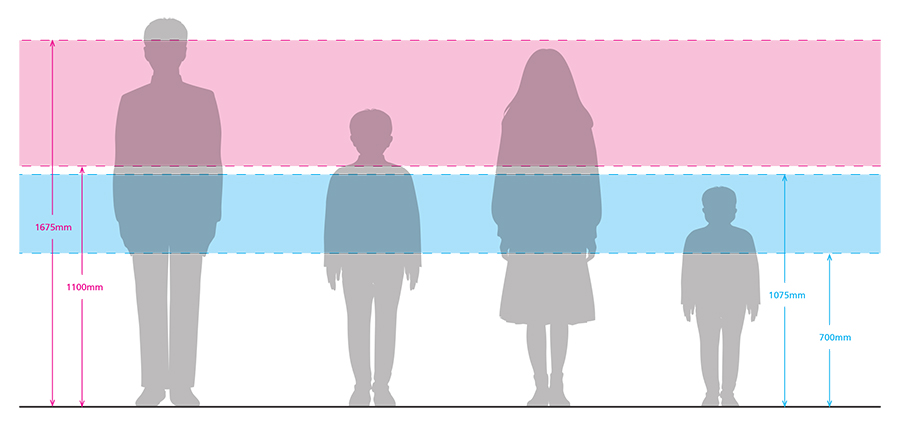
– Wall/screen-mounted graphics should wherever possible be positioned within the optimum viewing band [1100–1675mm] – People with low vision may need to be within 75mm of a label in order to read it. – Object labels should be located as near as possible to the object, so that both the object and the label can be seen from the same vantage point. –Object labels should be positioned consistently next to the object.
Labels should be mounted at 90 degrees to the line of vision and as close to the viewer as possible. They should also be visible to wheelchair users.
– If label rails are used, don’t position the top of the label above the maximum recommended height. – Position Braille labels at a consistent height and position, and on a horizontal or near horizontal plane (at between 600 and 700mm from floor level at the lefthand side) for the best reading angle.
Viewing bands for adults (pink) and pre-fives (blue).
Géraldine Heller and Fabio Spink took part in a competition for the redesign of the concentration camp memorial site in Neudorf near Vienna. In their contribution for Hochparterre-Campus, the two students from the Institute of Industrial Design HGK FHNW explain how they proceeded and what motivated them to design an ACOUSTIC PARK.