One of the great challenges in designing a product — digital or otherwise — is stepping outside yourself and climbing into the minds of your users. You love the wonderful new app you’ve designed, but will it appeal to others? Fortunately, the field of user experience design (UX) gives us tools to understand our users through surveys, interviews, card sorting, and user testing.
The Smithsonian Institution’s Office of Policy and Analysis has another tool to consider for your UX toolbox: IPOP. IPOP is model of experience preference created by Smithsonian behavioral scientists led by Andrew Pekarik, in collaboration with Professor James B. Schreiber of Duquesne University. It was formed to guide exhibition design, and born from years of research studies and interviews with Smithsonian visitors. Though created specifically for museums and physical exhibitions, IPOP is useful for anyone wanting to widen appeal and engagement.
IPOP is a useful framework for building a content strategy and thinking about audience diversity and preference differences. The model names four dimensions of experience. Individuals are drawn to each dimension in varying degrees and usually have a dominant preference among the four:
I: Ideas — an attraction to concepts, abstractions, linear thought, facts and reasons;
P: People — an attraction to emotion, human connection, affective experience, stories, and social interactions;
O: Objects — an attraction to things, aesthetics, craftsmanship, use, ownership, and visual language; and
P: Physical — an attraction to somatic sensations, including movement, touch, sound, taste, light, and smell.
The Canadian Museum of History is working on renewing the visitor experience through its three creative development specialists. Photo: Marie-Andrée Blais
Jean-François Léger recognises this from the outset: he has a “special profession”, in view of the world in which he works, that of museums. Indeed, he presents himself as a “specialist in creative development”. However, it is not surprising that he should become an example to follow, when the development – or “renewal” – of audiences remains an obsession in the cultural world. His work focuses on the visitor experience or, as this man of communication expresses it in his pictorial language, his role is to be the “visitor’s spokesperson” to the museum team. He tries to tame the “beast” that is an exhibition, but also works on web projects and publications. Working for the Canadian Museum of History since the time when it was still called the Canadian Museum of Civilization, Jean-François Léger seeks “to create unique, stimulating and innovative experiences. His hobby is not technological gadgets, but a theory based on “public preferences”. His four preferences, to be precise.
The IPOP model
This theory is known by the acronym IPOP and has been developed since 2010 by Andrew J. Pekarik of the Smithsonian Institute in Washington. It is based on the premise that museum visitors are challenged along four axes: ideas, people (and their stories), objects, and somatic and sensory experiences (including interactive and immersive modules). The letters IPOP, not to be confused with hip-hop, stand for “idea”, “people”, “object” and “physical”. “Originally, the idea of preferences was developed as a way of rethinking the diversity of audiences [and helping] exhibition designers to accept that their own preferences […] influence programmes designed for visitors,” summarise Andrew Pekarik’s IPOP presentation notes. “We tend to think of our own reactions as those of the visitors. It’s not a bad thing for a museum curator to bring what he feels as a human being,” admits Jean-François Léger, but he believes that we need to be able to take better account of the public’s preferences. This is the precept defended by the IPOP theory. The specialist from the Canadian Museum of History spoke about it at the most recent symposium of the Société des musées québécois (SMQ), held at the end of September. Jean-François Léger does not claim, even though he is the voice of the public, that the public determines what is exhibited, and how it is exhibited. We take the main idea of the exhibition, we develop the message, we think about the tour route, we propose a scenario,” explains Léger, who says he works with a whole team. We want to know how to introduce the subject, how to attract the public to the objects, how to surprise them. » The texts in the rooms, he gives as an example, are among the things he and others evaluate. You have to think about who is speaking, you have to define the voice of the museum and those of the other participating parties. “When you put on an exhibition, you are interested in who speaks,” he says.
From one voice to another
In other words, just because we listen to the public does not mean that we do not pay attention to what the designers of an exhibition want to express. Anyone who has looked at a wide variety of subjects, from religion to voodoo to Inuit drawings, acknowledges that he or she does not control the public’s choices. “Not at all,” he insists. He was surprised by the surprising responses from children at the exhibition on religion – God(s), instructions for use (2011-2012) – while the comments from adults seemed stereotypical to him. Later, during the Vodou exhibition (2012-2014), he saw how the video testimony of an animist priest demystified the object on display next door. Jean-François Léger says he has learned a lot from these past experiences. He assures that knowing what attracts people helps to think better afterwards about how the whole thing will be put together. But that, from one time to the next, the exercise needs to be repeated. So an exhibition will not be better because it has all the treasures of the world, believes Jean-François Léger, nor because it completely meets the public’s expectations. You have to be attentive to what the visitor is looking for, but you also have to make sure that he or she is surprised. He also insists on the teamwork involved in creating an exhibition. The main challenge, he says, is to stimulate the creativity of all visitor experiences, whether cognitive, sensory or emotional. While the model developed in Washington is enthusiastically adopted by Jean-François Léger, this is not necessarily the case for all his colleagues and fellow members. Including at the Canadian Museum of History, where three of them are specialists in creative development. A still rare profession whose approach has yet to be implemented.
In this joyful, heartfelt talk featuring demos of her wonderfully wacky creations, Simone Giertz shares her craft: making useless robots. Her inventions — designed to chop vegetables, cut hair, apply lipstick and more — rarely (if ever) succeed, and that’s the point. “The true beauty of making useless things [is] this acknowledgment that you don’t always know what the best answer is,” Giertz says. “It turns off that voice in your head that tells you that you know exactly how the world works. Maybe a toothbrush helmet isn’t the answer, but at least you’re asking the question.”
The museum occupies a central place within the cosmist worldview as an institution dedicated to the preservation, conservation, and restoration of the past. It is a singular place in human society where a broken appliance, a damaged picture, a ceramic shard, or an unfinished poem are not discarded, but systematically preserved and maintained. The cosmist museum is encyclopedic and nonviolent. As a collection of everything, its mission is to restore life, not take it. Nikolai Fedorov writes that the museum is related to the school and the observatory. The ancestral memory it preserves in the form of artifacts, botanical specimens, animal and human remains is mirrored in the constellations of the stars. The museum is related to ancient temples and the knowledge it transmits is astronomical. According to Fedorov, the museum will be the site of resurrection once museological technologies of restoration are radicalized to restore life. “If a repository may be compared to a grave, then reading, or more precisely research, is a kind of exhumation, while an exhibition is, as it were, a resurrection.”[1]
The museum of the Institute of the Cosmos is comprised of an infinite number of rooms. Each room contains a permanent exhibit. We invite you to visit Room #12, containing an exhibition by Arseny Zhilyaev, signed by the algorithmic artist Robert Pasternak. The room presents a suite of sculptures devised by Robert Pasternak in the distant future, in an attempt to understand its origins, which are closer to our present time. Based on satellites, rockets and space stations developed during the early days of space exploration, these sculptures can be downloaded and printed on a 3D printer.
More rooms will open in the near future, with projects by artists and curators including Victor Skersis, Jonas Staal, Ahmet Ögüt, Iman Issa, Pierre Huyghe, Bahar Noorizadeh, Nikolay Smirnov, Liam Gillick, Maha Maamun, Emilija Škarnulytė, Oleksiy Radynski, Boris Groys and others.
The Timeline of Russian Cosmism is a chronological mapping of key developments in art, literature, poetry, science, politics, technology, philosophy and numerous other fields, as they pertain to cosmism. Researched and edited by Anastasia Gacheva, Marina Simakova, Arseny Zhilyaev and Anton Vidokle, the timeline traces the influence of cosmist thought on culture and society, starting with the sighting of the comet 3d/Biela, which triggered the global panic of the 1820s, to the present day. The timeline is ongoing: more entries will be added expanding its content as we move into the future and rediscover the past.
In the 1920s, the historian of art and culture Aby Warburg (1866-1929) created his Bilderatlas Mnemosyne tracing recurring visual themes and patterns across time, from antiquity to the Renaissance and beyond to contemporary culture. His approach provides inspiration for today’s visually and digitally dominated world. At HKW all 63 panels of the Atlas will be recovered for the first time from Warburg’s original images.
Aby Warburg with Gertrud Bing and Franz Alber in front of Warburg’s panel design, Rome, Palace Hotel, May 1929
Aby Warburg studied the interplay of images from different periods and cultural contexts. He designed the Mnemosyne Atlas to provide a pictorial representation of the influences of the ancient world in the Renaissance and beyond. In its last documented version, the Atlas consisted of large black panels on which Warburg placed photographic reproductions of artworks from the Middle East, European antiquity and the Renaissance, alongside contemporary newspaper clippings and advertisements. In the years leading to his death in 1929, Warburg and his closest colleagues Gertrud Bing and Fritz Saxl experimented with the form and function of the Bilderatlas. Their goal was to present a publication designed for discussion among experts as well as the broader public. During the course of its creation, the Atlas developed into an instrument of cognition.
Aby Warburg, Bilderatlas Mnemosyne, panel 39 (recovered, detail) | Photo: Wootton / fluid; Courtesy The Warburg Institute
Warburg’s method set new standards: it consisted in rearranging canonized images and looking at them across epochs. His project traversed the boundaries between art history, philosophy and anthropology and was fundamental for the modern disciplines of visual and media studies. Today, his use of visual memory provides inspiration and alternative routes through a reality dominated by visual media.
The exhibition at HKW restores the last documented version of the 1929 Atlas almost completely with the original images. In collaboration with the Warburg Institute in London, the curators Roberto Ohrt and Axel Heil have located most of the originals, some partly in color, 971 images from the 400,000 individual objects in the Institute’s Photographic Collection to show all 63 panels of Warburg’s unfinished magnum opus for the first time since his death. In addition, 20 unpublished large-scale photographs of panels that were previously only accessible in the Warburg Institute archives will be shown: Most of them made in autumn of 1928, they originated from the previous versions of the Atlas and are presented as large prints of the original black and white negatives.
In 1997 two spaceships were launched from Cape Kennedy containing material to represent life on earth. The ambition of the project was to make hypothetical contact with extra-terrestrial intelligence. The choice of material was subjective to an American, scientifically educated, 1970s community, with paternalistic attitude towards the rest of the world. But who consulted us? We were not asked to make a contribution and we must do something about this falsification, especially now as we approach the end of the second millennium, when everyone is making lists and taking stock of what has been achieved.
With a mixture of irony and seriousness, the filmmaker, artist and director has chosen to put together his own shopping list called 100 objects to represent the world. After presenting this 100 objects in an exhibition at Vienna’s Hofburg Palace in 1992, Greenaway now brings the objects to an audience instead of bringing the audience to the objects: in a completely new and theatrical setting, light, sound, voice and music will be part of a modern opera – a prop opera. The importance of the prop should not be underestimated in our own materialistic and icon-producing world. Can you imagine a Chicago Gangster Film without a gun? But the objects to represent the world are not inanimate but are presented in a mixture of Machiavellian, galactic toy store and Faustian dream space.
The opera set is an installation that can be contemplated on stage also before and after the performance.
The 100 objects are presented in a sequential narrative by Thrope the Misanthrope, who guides us and Adam and Eve (two silent, naked actors) to show what mankind has really learned during the past millennium: from the comforts of domesticity and sentiment, through the delights and torments of sex, power and money, to the tragedies of war, disease, loss and death. This journey is to be traveled in 70 minutes, structured by Thrope’s spoken discourse. His dramatic performance is accompanied by the soundtrack of Jean-Baptiste Barrière (engineered at IRCAM Paris), making him a teacher, a pedant and persuader, a charlatan and preacher.
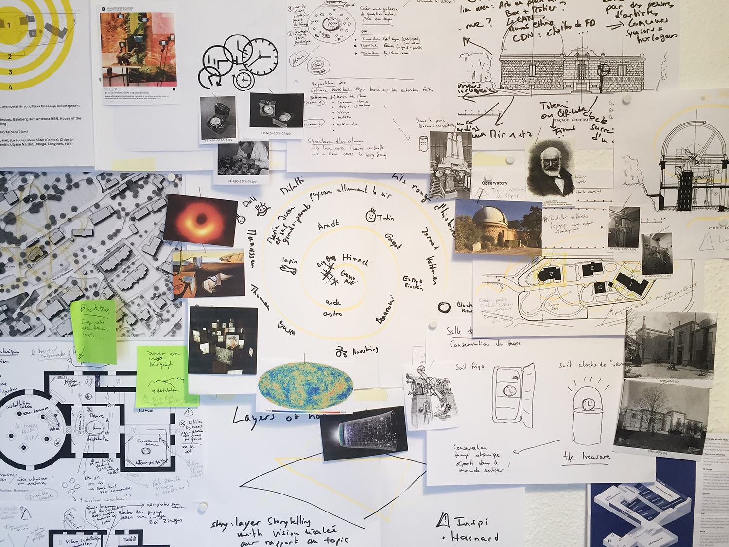
The Tourist Office of the canton of Neuchâtel has been developing several concepts for visits around the topic of watchmaking and time measurement for several years now. It will be necessary to work with them to promote the exhibition project at the Neuchâtel Observatory and include it in their programme.
The Franco-Swiss region between Besançon (historic watchmaking city with its mythical observatory) and La Chaux-de-Fonds has developed a concept of “Time measurement route”. It would be interesting to inscribe Neuchâtel with its observatory to link the two historical observatories because historically they worked together! PDF file of the flyer.
When “Mark Twain” was cut down in 1891, the giant Sequoia was 1,341 years old and measured 331 ft (100.9 m) high and 90 ft (27.4 m) in circumference at the base. Today a stump is all that remains of the once thriving tree that might have survived another thousand years. A cross section is on display at the American Museum of Natural History in New York; the curator at the time marked on its annual rings selected events of human history.
Photo Credit: Compton’s Pictured Encyclopedia and Fact Index (1947)
The bestselling author Marie Corelli, inspiration for the eccentric Lucia in E.F. Benson’s Mapp and Lucia novels, refused to change her clocks after the UK’s Summer Time Act was passed in 1916. She described people who went along with the practice of advancing time in summer months as “the sheep of humanity”. Instead, she believed in the sun and sailors. In Mapp and Lucia’s town of Tilling, real time was God’s time, and not to be trifled with.
But Corelli was wrong to hold that Greenwich Mean Time (GMT) was any truer than its hour-offset sibling. It is often claimed that the development of railways across the U.K. from the 1830s onwards led to the standardisation of time—to the use of GMT across the whole country, rather than the myriad local times kept by sundials on churches and public buildings in each town or village. It is true that railways ran better with one single time on their timetables. But local time clung on longer than we might assume. It was not until 1880 that a law was passed defining GMT as the U.K.’s standard, and in the end it was more about the Victorian temperance movement demanding liquor licensing with time restrictions than it ever was about railway timetables. ….
Museum exhibits can be pricey. Whether it’s a permanent installation or a travelling exhibition, myriad influences can affect the cost. Image acquisition, AV hardware, shipping, materials, and more, can quickly throw a conservative project budget way off track, unless these aspects are carefully considered during the design process.
Current estimates for the cost of museum exhibits are around $75 to more than $800 per square foot. This ridiculously wide range is due to a number of factors that differ from project to project, but which clearly make exhibit budget planning difficult, uncertain, and frightening. Whether your institution is flush with cash or on a shoestring budget, here are five proven methods for keeping your exhibition project costs in check:
Have a Contingency
A contingency is money set aside, to be used for increases in market costs or unforeseen items and services. For an exhibit project, it’s wise to have both a design contingency and a fabrication contingency. The design contingency can help fund great ideas that are born during the creative process, which might be financially more ambitious than the original program. A fabrication contingency will cover unpredictable costs related to things like travel, shipping and materials.
Reduce the Scope of Work
As the saying goes, “You can have anything, but you can’t have everything.” One of the fastest ways to get your exhibit costs in-line with your budget is to trim some of the fat. This could include implementing strategies such as reducing the project’s square footage or decreasing the number of trips or meetings.
Involve Fabricators Early
Whether you’ve hired a design-build firm or a sole exhibit design specialist, it helps to bring in a fabricator during the creative process. An exhibit fabricator can assess the physical design – from as early as the concept phase – to provide accurate cost estimates, material and finish suggestions, and coordinate ongoing museum architecture or general contracting work.
Communicate Honestly
This is a two-way street. Exhibit designers owe it to their museum clients to be frank if the project expectations and brainstorming ideas outweigh the project budget. Likewise, if during the creative process a designer is recommending solutions or technologies beyond your comfortable reach. If this happens then you need to speakup, put on the brakes, and reevaluate what your budget can afford.
Avoid the Bandwagon
It’s easy to get caught up in high-tech trends, and to assume that your visitors expect theatrical immersion, multi user interactive tables, mobile apps, and AR or VR experiences. Although these things can enhance a museum exhibition and provide unique content delivery, they may not be realistic within a conservative project budget. Consider these costs at the beginning of the project and involve a media developer in the conversation so that s/he can share ideas and provide alternatives that fit within your budget.
It’s likely that following just one of these five strategies will help to keep your exhibit project on budget, but you may need to meld a few of them. Working with your partners, the project budget should be discussed and re-assessed from day one – from the kickoff meeting through to the project’s grand opening. Everyone must be aware of the budget, so that the entire team can be responsible for keeping it in check.